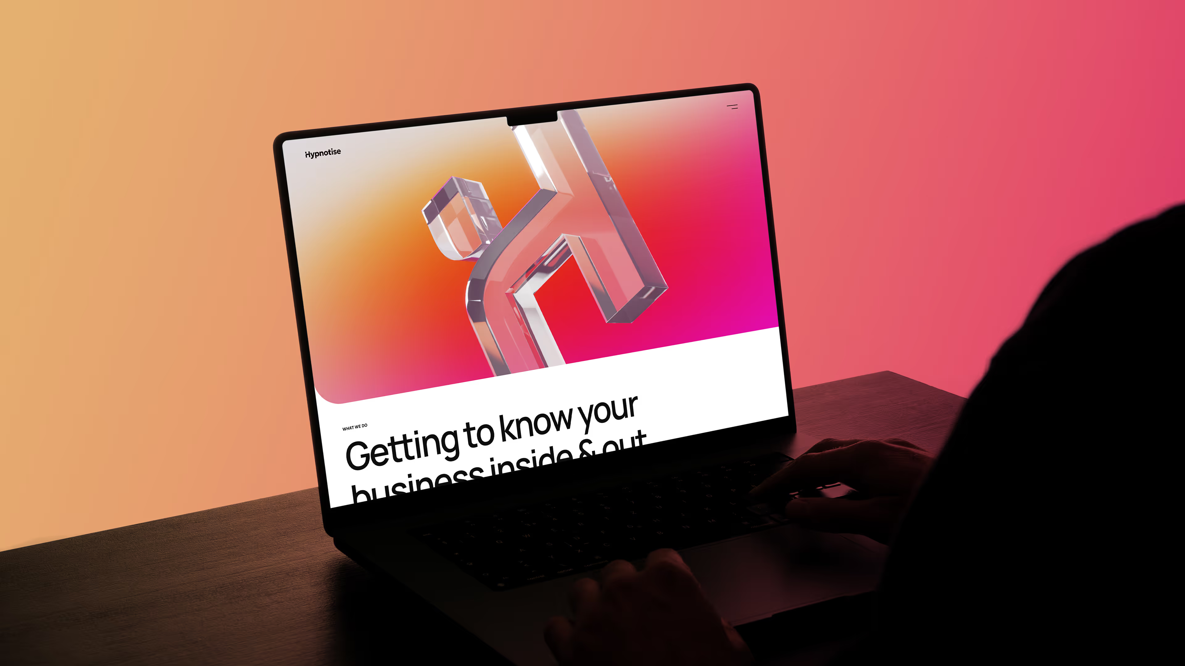
A rebrand to empower the next generation of startups
Hypnotise set out to break the mould. Rather than just producing websites or interfaces, the studio made it their mission to bring great design to startups and local businesses, building close relationships and understanding every detail of how they work. It was an approach that kept them agile and effective, yet the old identity failed to keep up.
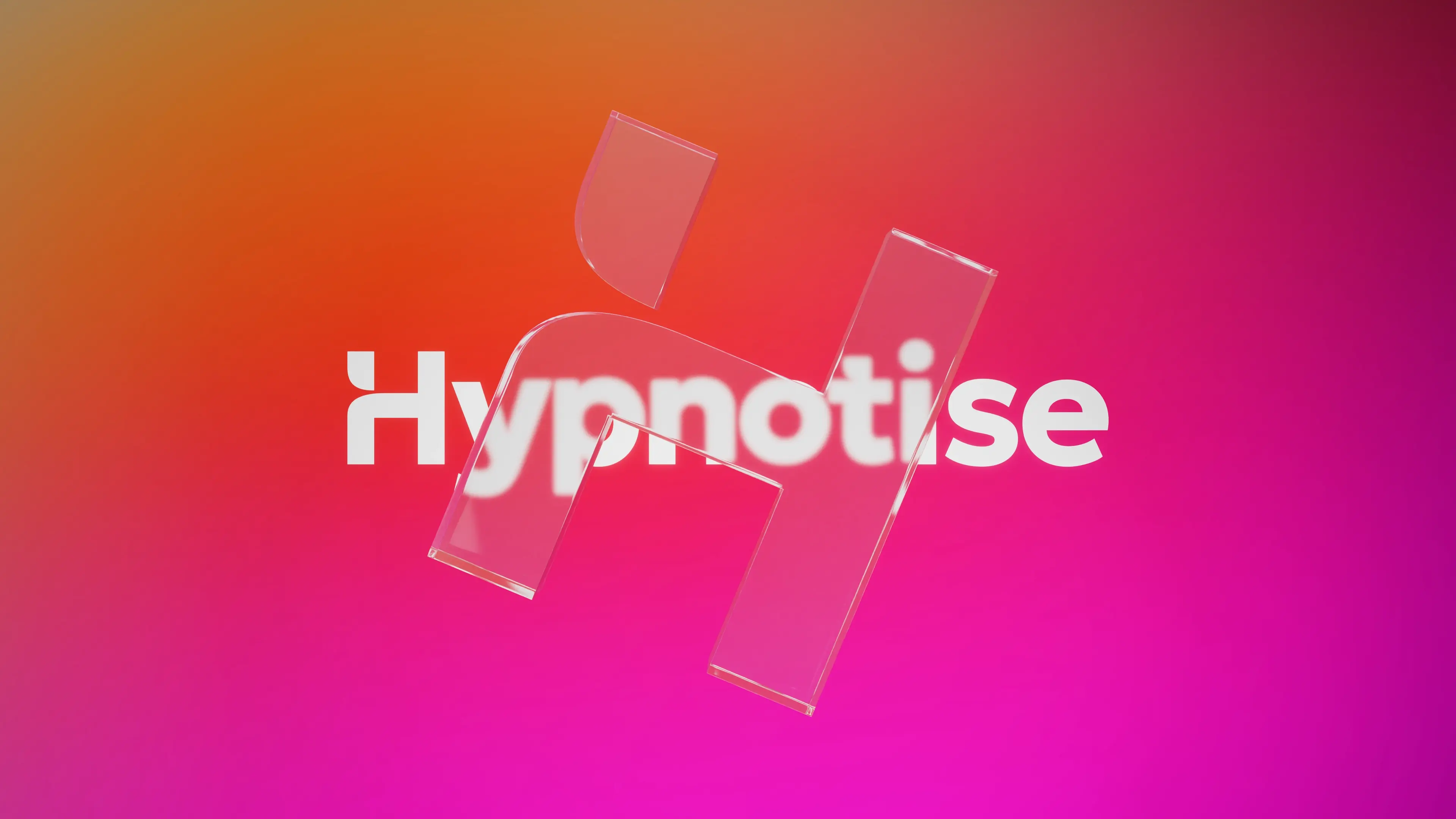
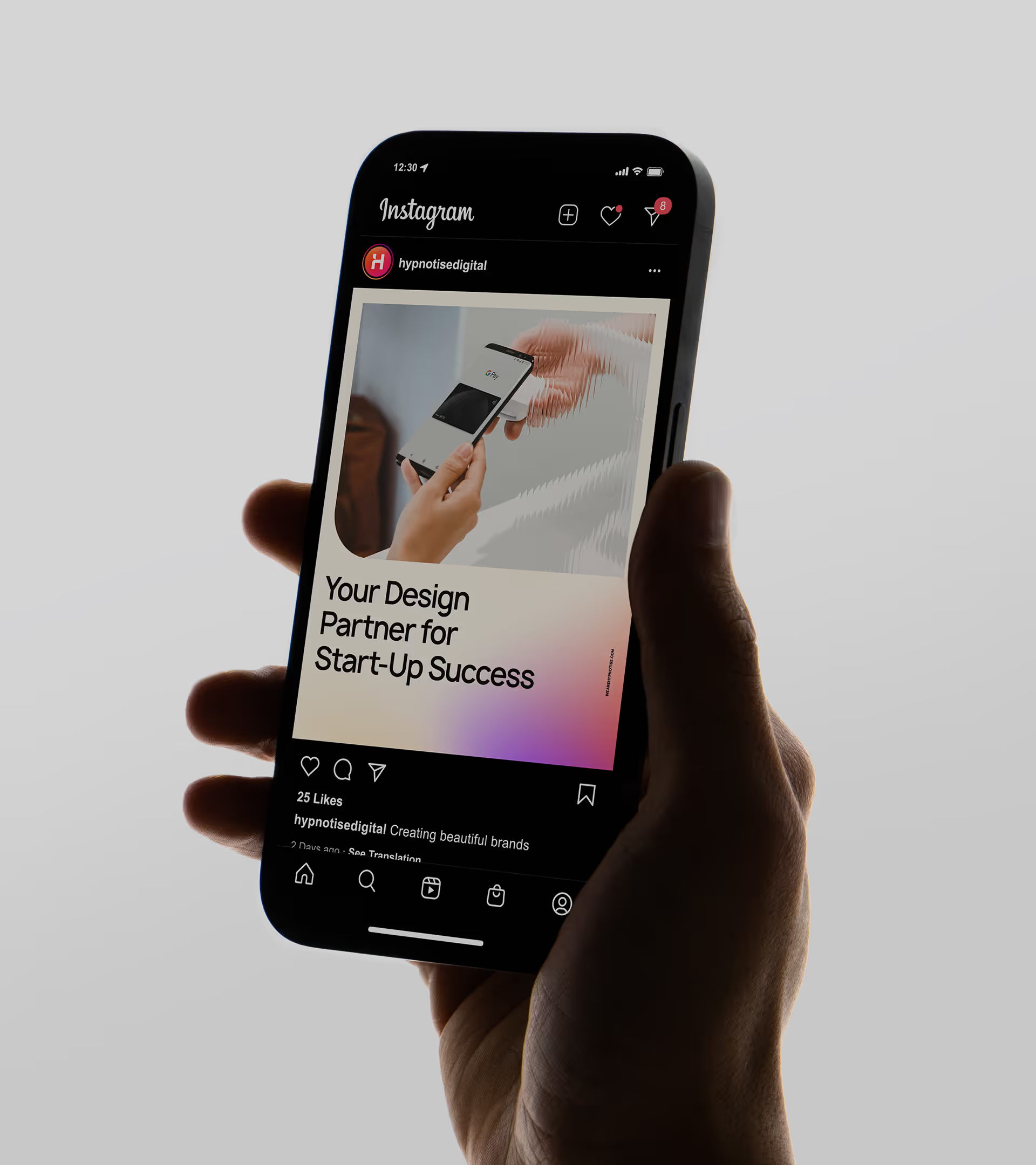
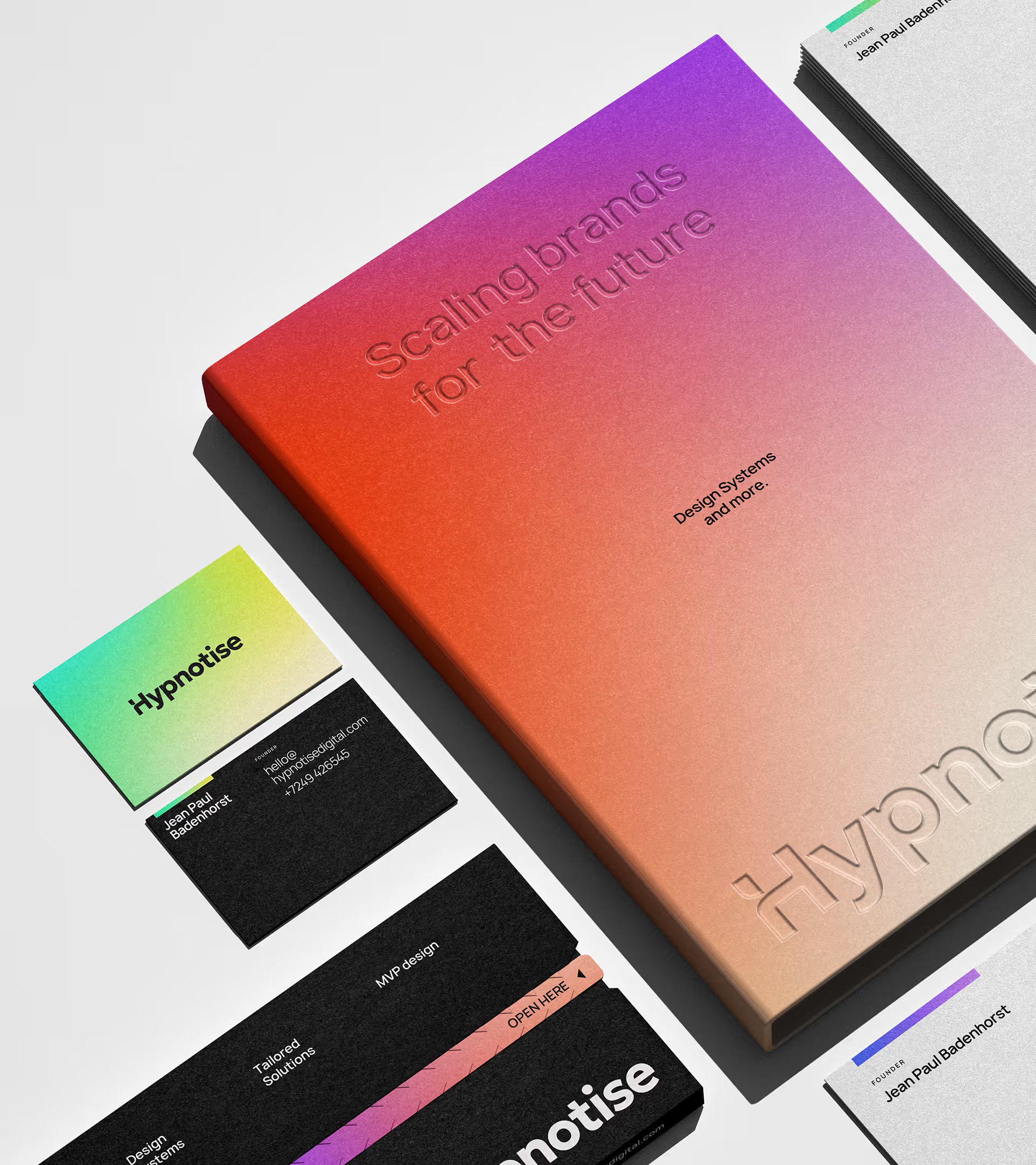
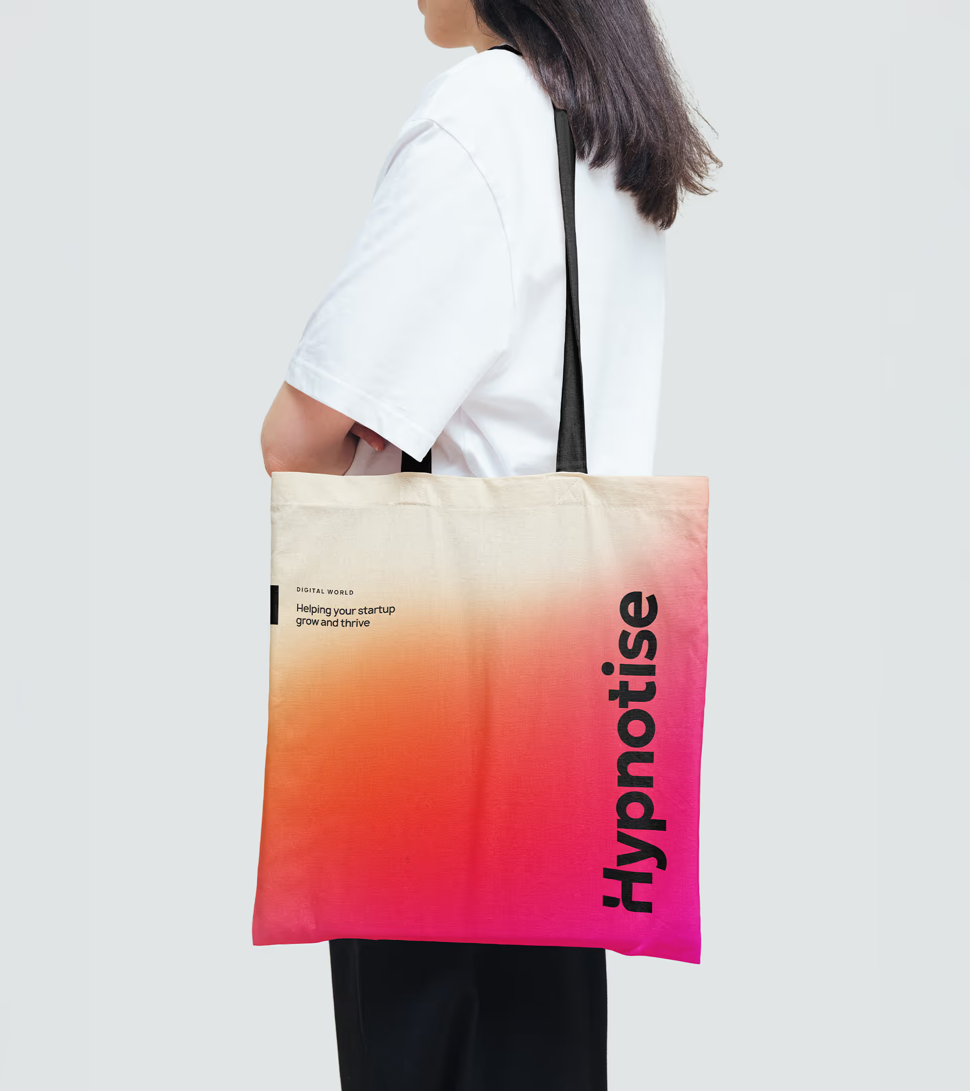
We built a visual identity that reflects this approach: bold, vibrant, and dynamic, with a playful edge. The web can feel like a colourful but disjointed world, so the new identity puts Hypnotise front and centre, turning the ‘H’ into a tangible object that anchors the brand in the digital world. The ‘H’ interacts with images and typography to give the impression of a studio that is approachable, friendly, and present at every stage, helping brands navigate the digital world with confidence.
The system all comes together to form a brand that communicates what Hypnotise is all about: Building meaningful relationships with clients and helping them to succeed online.

.avif)
.avif)
.avif)
-copy.avif)
.avif)
.avif)
.avif)