Better coffee, less impact

Coffee culture is booming, but so is its environmental footprint. Most beans are still roasted with fossil fuels, a process that is anything but sustainable. Nox set out to prove there is a better way: sourcing ethical beans and using modern electric methods to roast with less impact on the planet. They needed a brand that could embody this mission and stand confidently alongside bigger competitors.
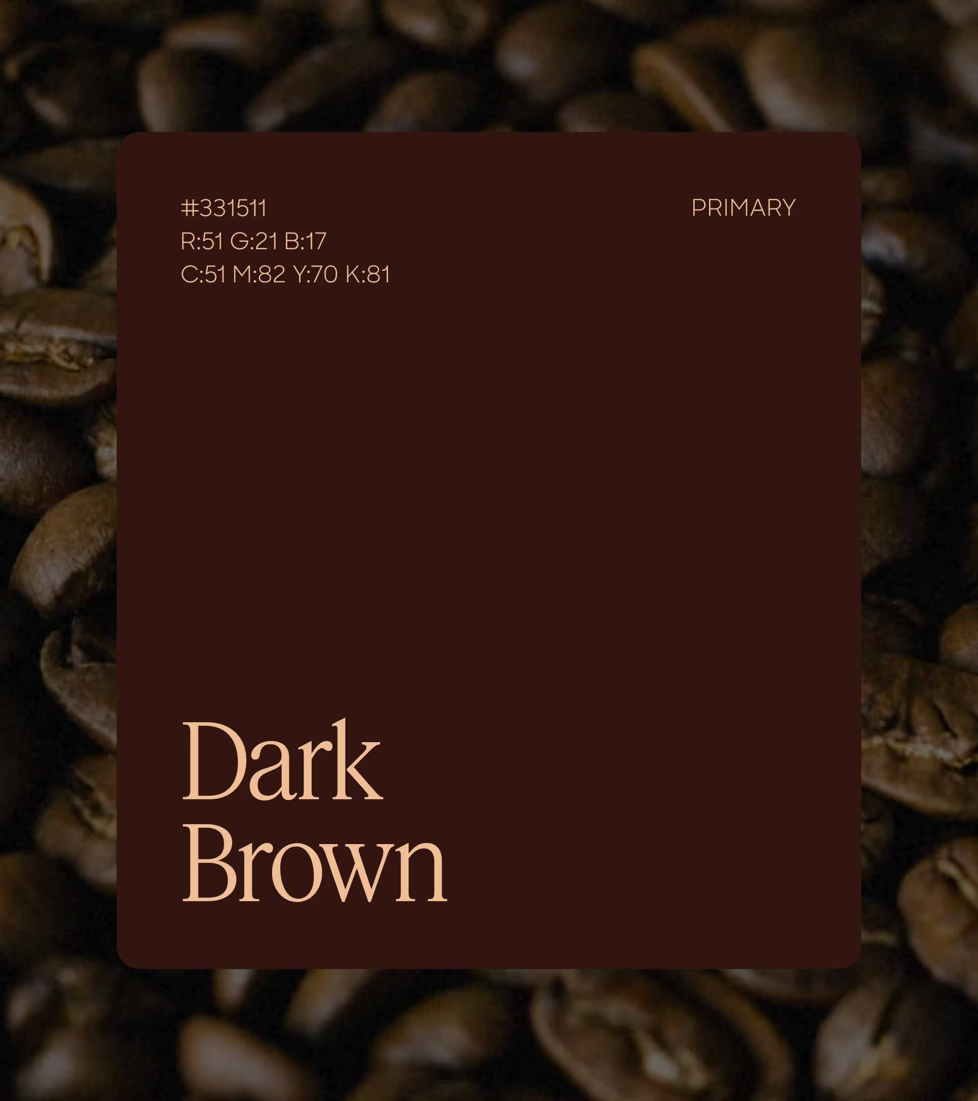
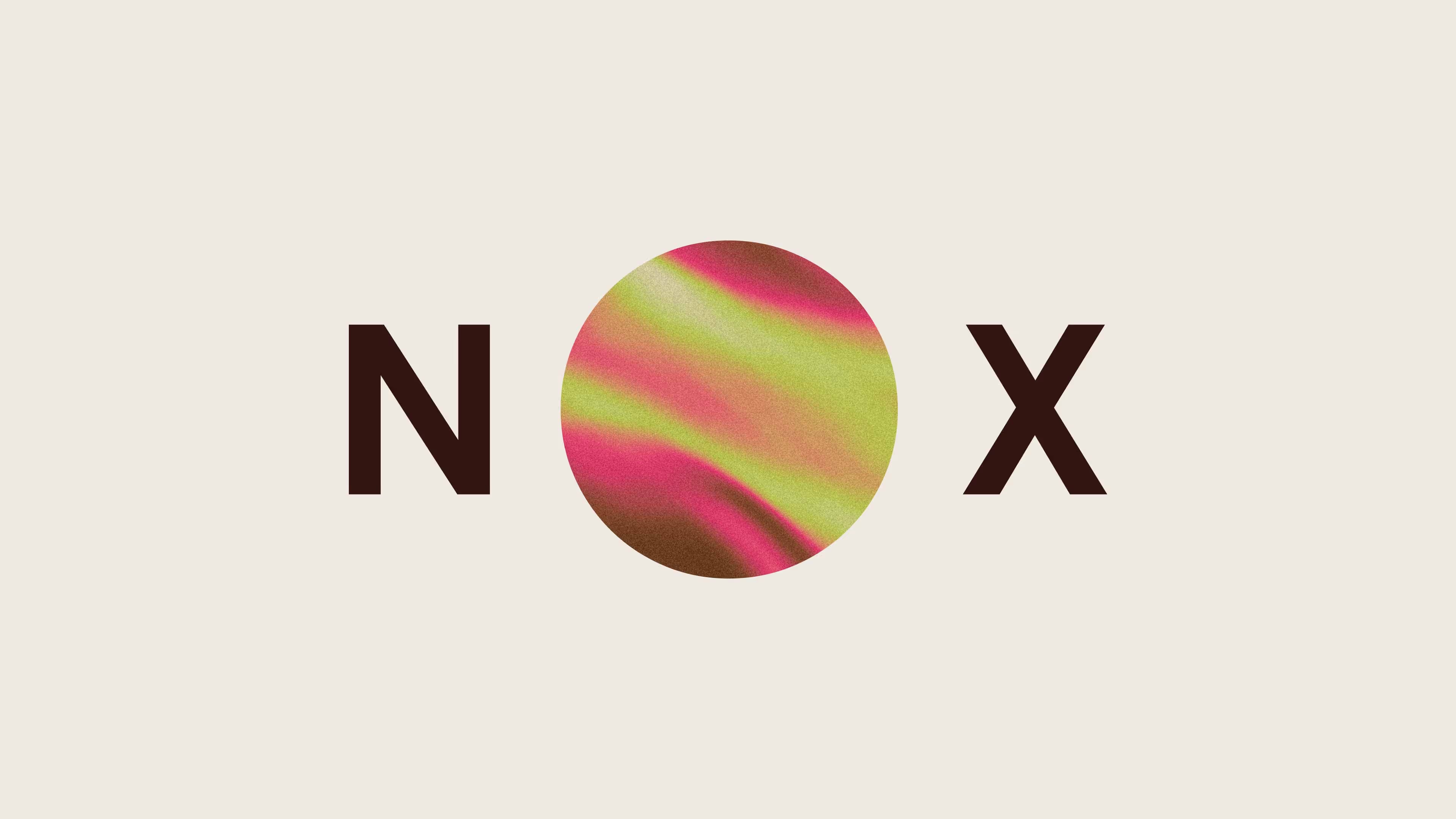
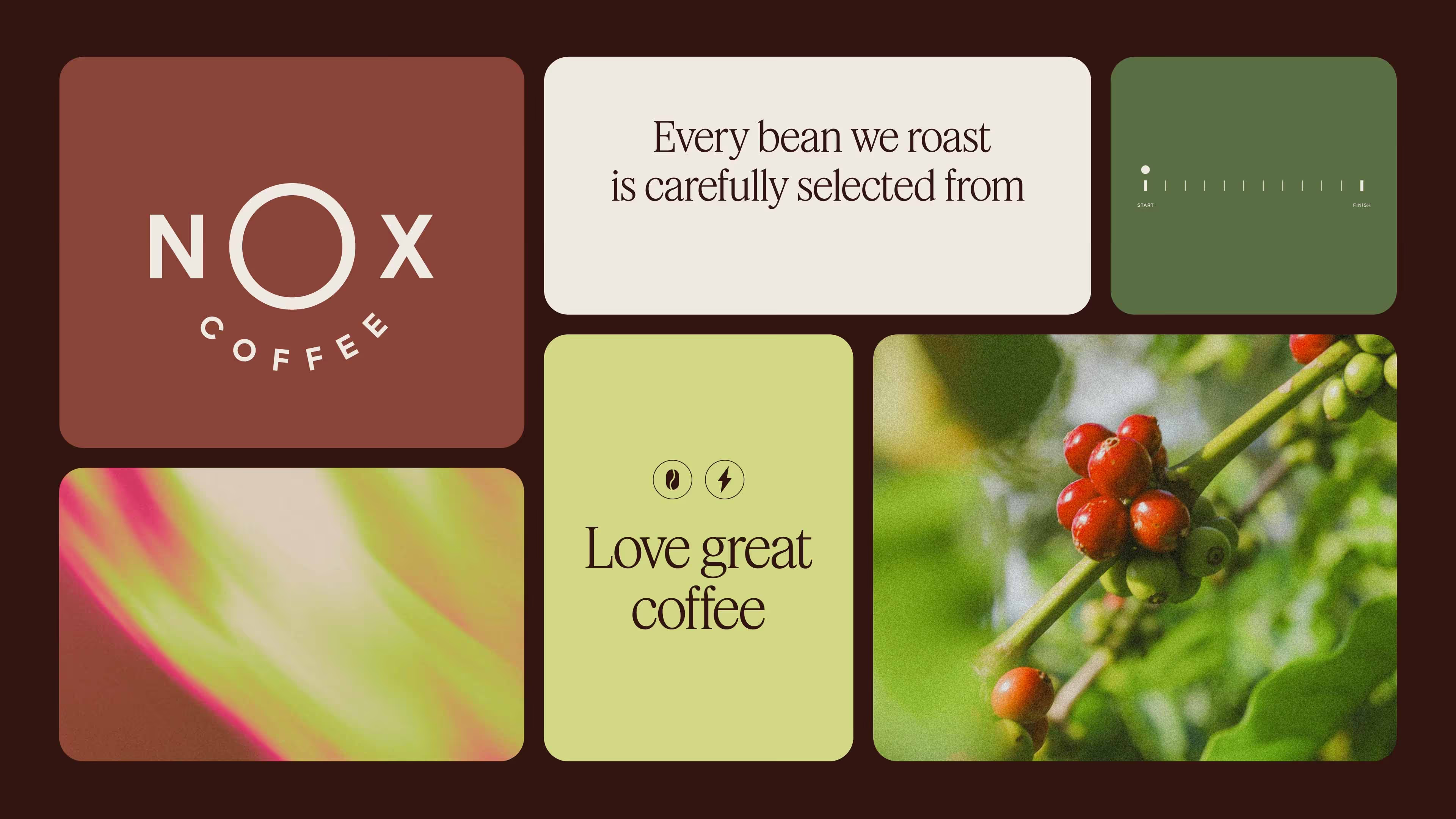
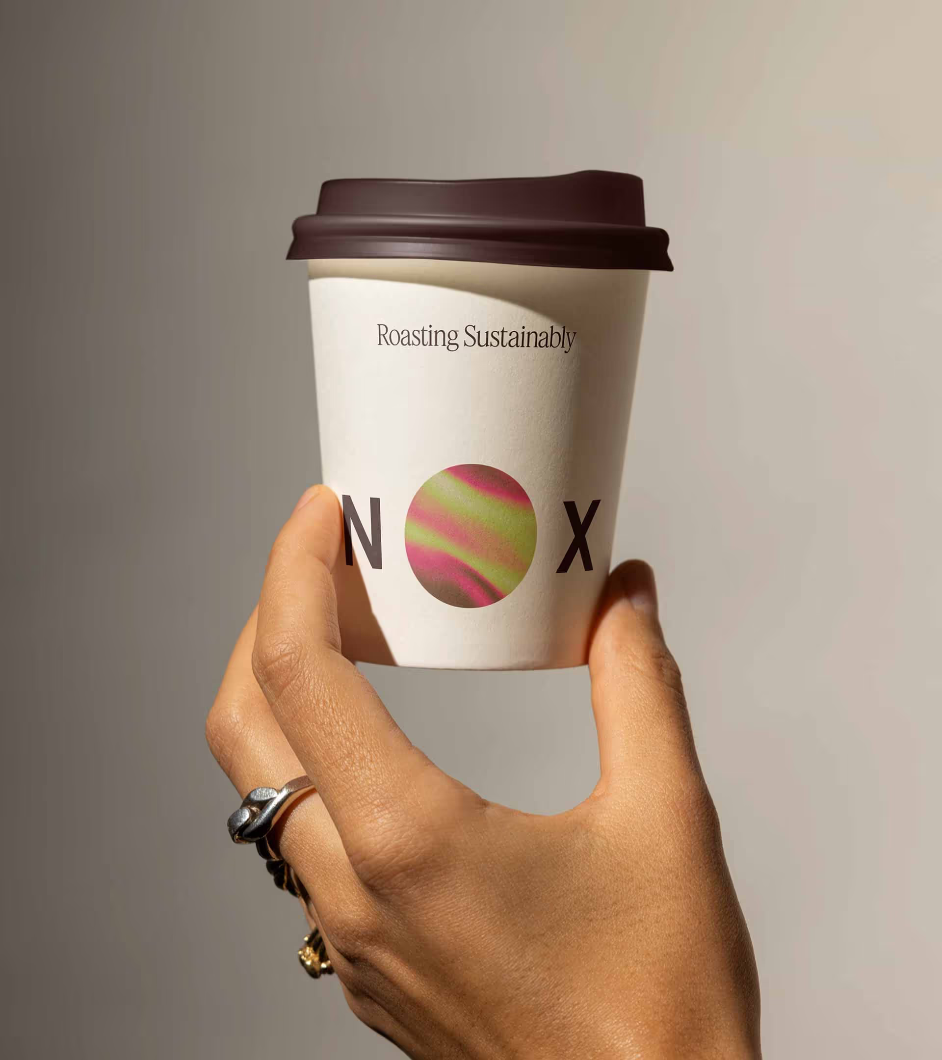
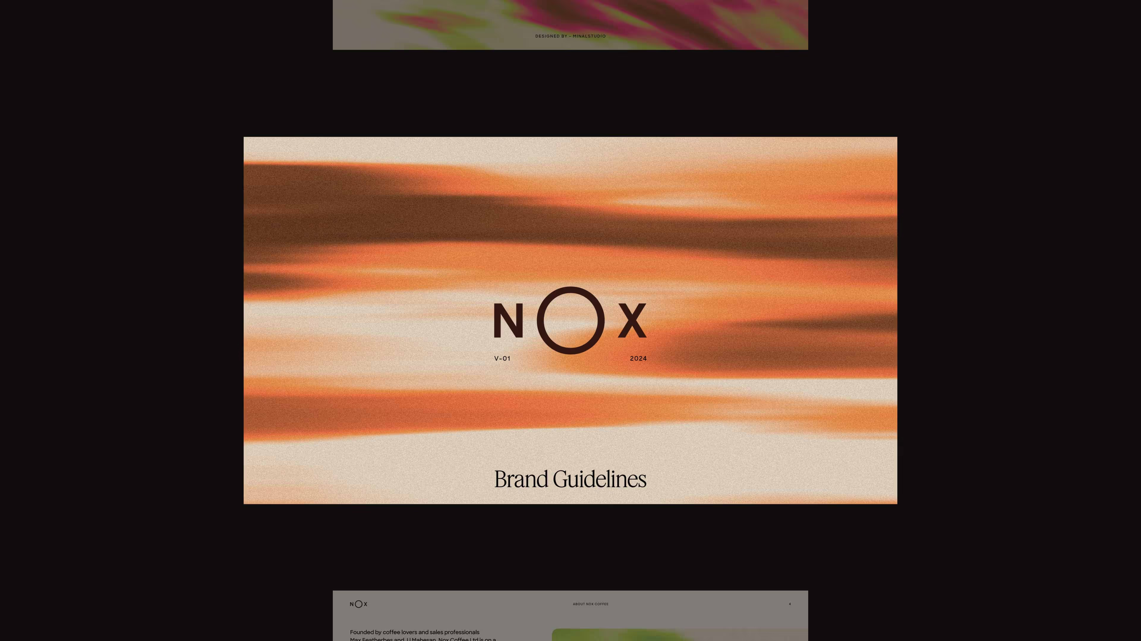
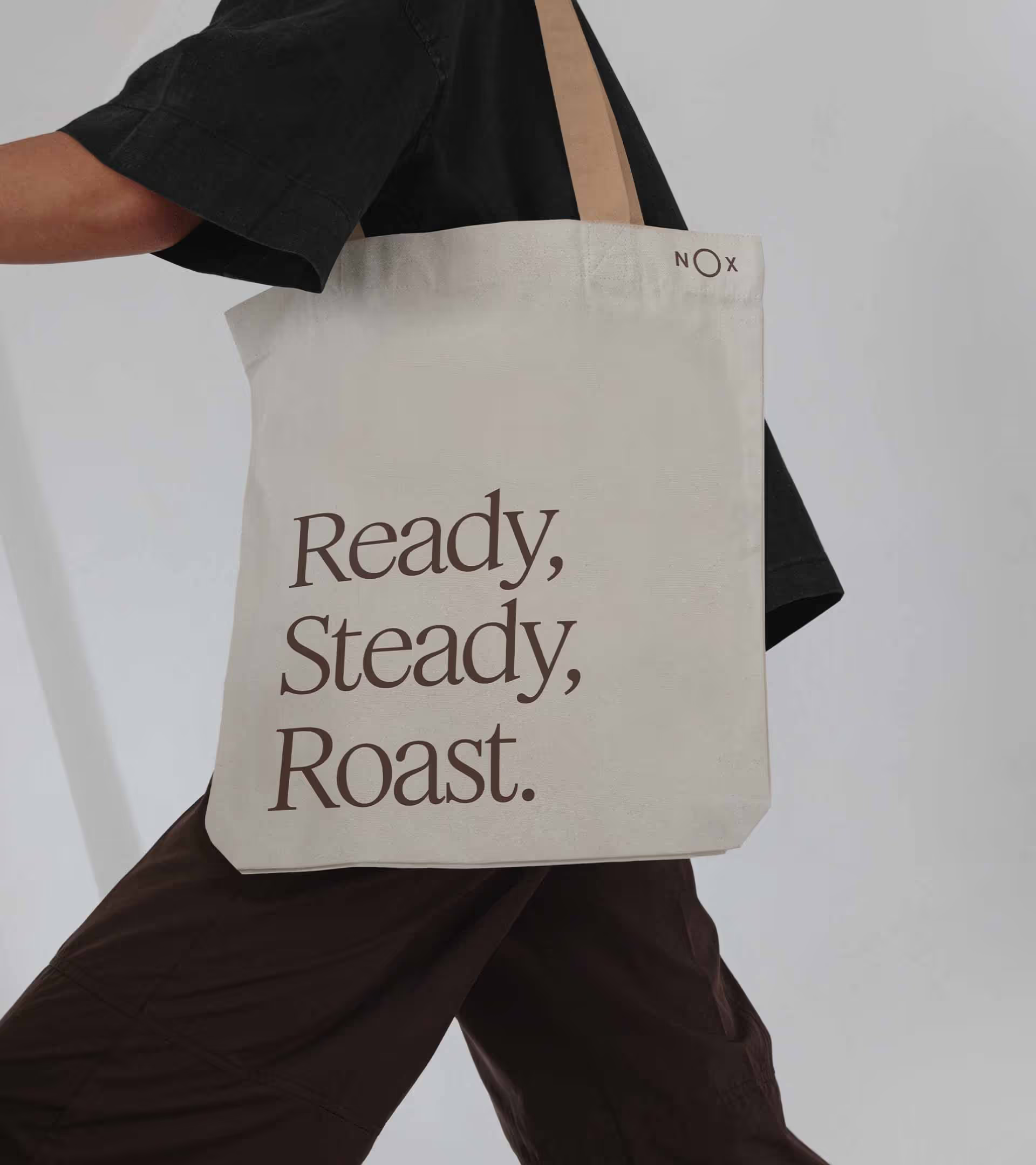
At the heart of the identity, the “O” in Nox becomes a window into the roasting process, alive with heat, colour, and movement. Rich textures spread across packaging and visuals, anchored by an elegant serif typeface and a muted palette inspired by natural coffee tones.
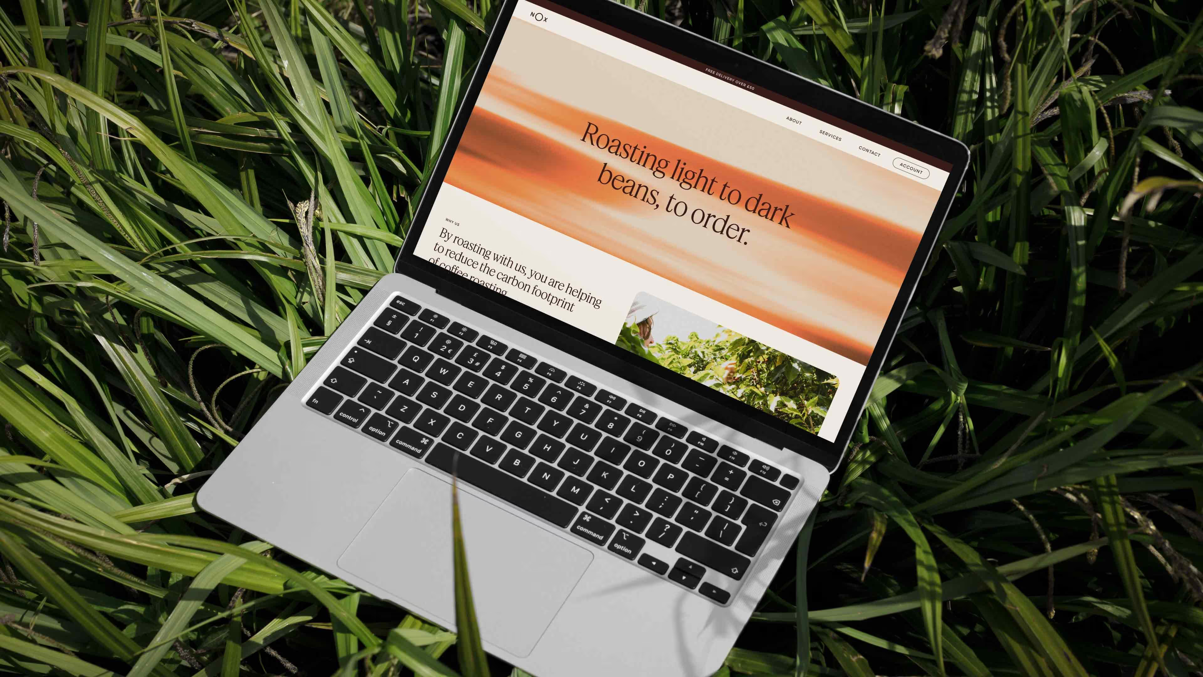
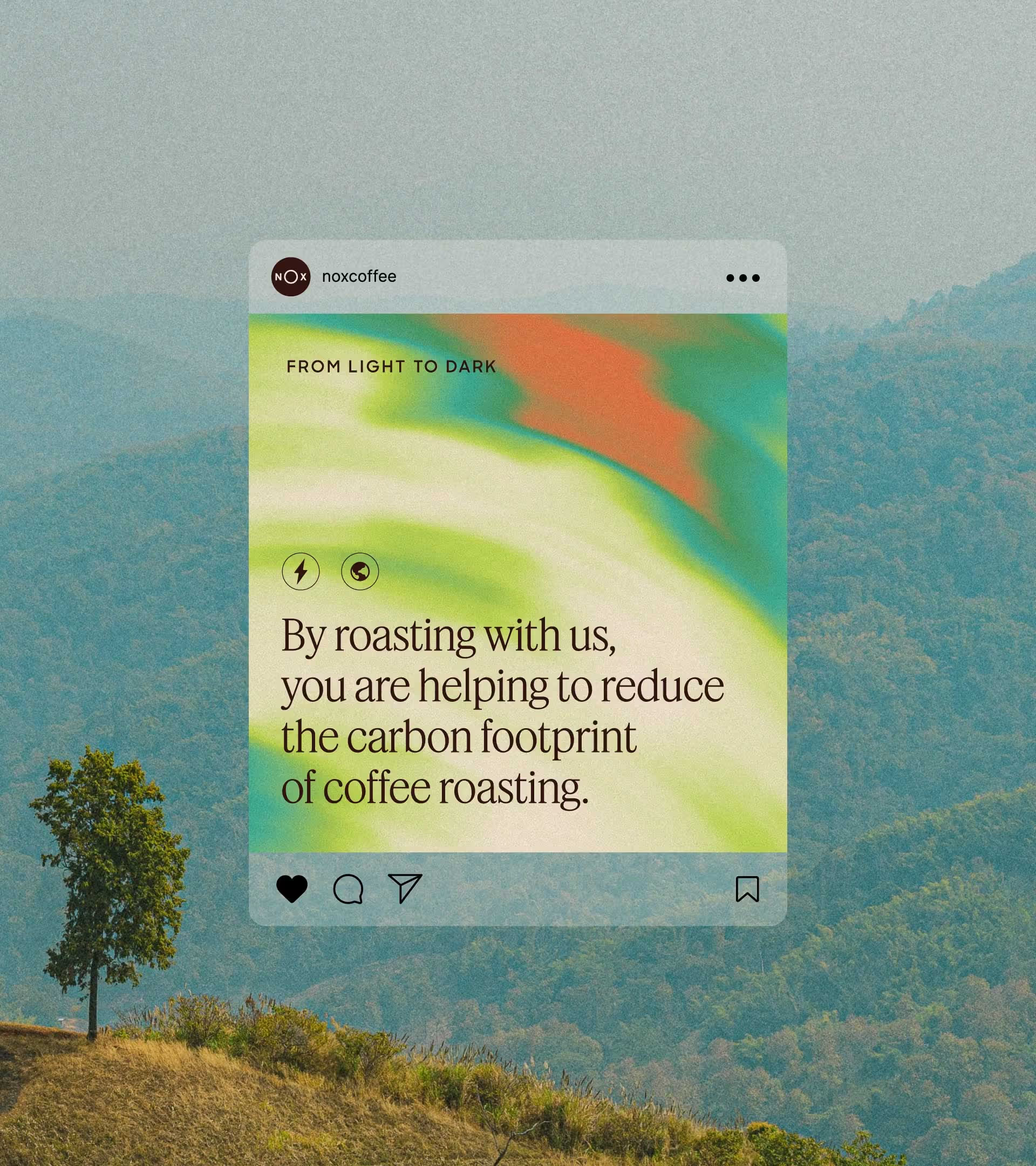
In application, the identity comes alive through animated typography that swirls like freshly ground coffee, while film photography adds a warm, tactile depth. The result is a brand that feels as good as the coffee.